Designing user experiences is all about anticipating and meeting the needs of users in a way that allows them to intuitively interact with a website, app or device. Good UX works so seamlessly that many users won’t even notice it.
But whether users notice it or not, good UX is fundamental to any positive interaction experience. You can dress up a product in gorgeous graphics and use the latest code to make it work, but if the UX is confusing or counterintuitive, users are bound to feel frustrated and annoyed.
UX can involve many things, from smart navigation to clear organization of information and from responsive communication to surfacing relevant choices. There’s also plenty of non-digital UX out there in the world! Let’s take a look at some examples of brilliant UX design. In each of these, I’ll focus on the parts of an interaction that are particularly well done and what you can learn from them.
Here are the examples we’re going to explore:
- Disney+ landing page
- Quibi rotating video
- Apple compare items
- Threadless add item experience
- Zoom experience
- Finding more examples of great UX design
Let’s get started!
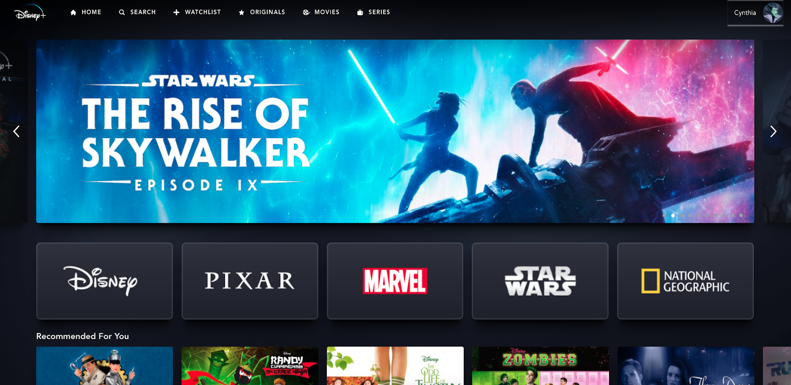
(Image credit: Cynthia Vinney, Disney+ landing page)
1. Disney+ landing page
Sometimes, a user experience can be improved by making one simple change to an otherwise familiar design. The Disney-centric streaming service Disney+, which assembles all the movies and TV shows from the company’s vast catalogue in one place, does just that. After logging in, users are presented with a landing page that will look familiar to anyone who’s ever used Netflix. It includes a big featured area at the top and horizontal rows of video options organized by genre or other recommendation criteria below.
But in between those two familiar elements is a set of logos representing Disney’s five brands. Because each of these brands is so popular and already has its own identity, each logo immediately communicates what users can expect if they select one of them.
Craving a superhero movie? Go to the Marvel section. In the mood for a nature documentary? Check out National Geographic. Want to travel to a galaxy far, far away? Select Star Wars. By recognizing the content available on Disney+ can be categorized in a unique way that communicates something valuable to users, the streamer provides a new means for users to quickly access the movies and shows they’re searching for.
What We Can Learn From Disney+
Always consider new ways to divide information, even for UX designs that are based on established interaction patterns. While you may not want to change a classic user experience too much, if there is an innovative, easy-to-understand way to communicate categories of information and help users navigate to the content they want, users will appreciate its inclusion in the design.

(Image credit: Emerson Schroeter, Quibi landing page)
2. Quibi rotating video
The mobile-first video-streaming app Quibi launched with one especially exciting innovation: rotating video. While most video content appears in landscape no matter how you orient your mobile device, Quibi’s videos fill the screen whether your device is in portrait or landscape, and also rotate seamlessly between the two. While the technology to make this work is no doubt complex, the idea behind the innovation is an example of fantastic UX design. It recognizes a UX issue with the way we watch videos on our mobile devices and creates a simple, elegant solution to fix it—a solution that seems so obvious, many users will likely wonder why it didn’t happen sooner.
What We Can Learn From Quibi
Sometimes an obvious solution is the best one. For long-running issues with interactive experiences, such as the orientation of videos, UX designers and users may easily reach the same conclusion about how to improve things. In this case, the UX designer shouldn’t over-complicate or over-think things; they should simply give users what they want.
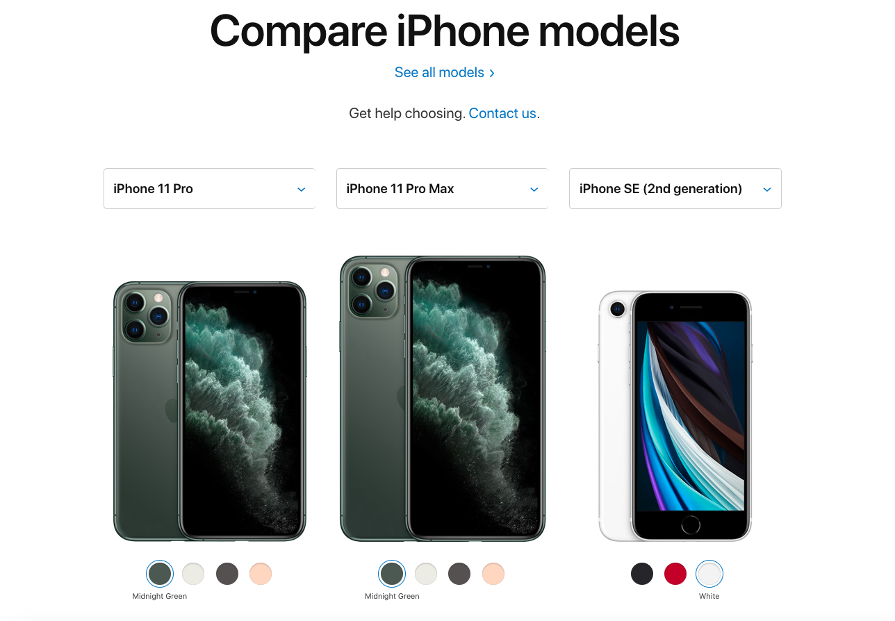
(Image credit: Cynthia Vinney, Apple’s Compare Phone Models)
3. Apple compare items
There are many parts of Apple’s website that make it a successful user experience, however, one of my favorite parts of the site is the compare products feature. There, you can pick up to three items from a particular product category and see a side-by-side comparison, something that’s especially useful for products whose specs may only be somewhat different.
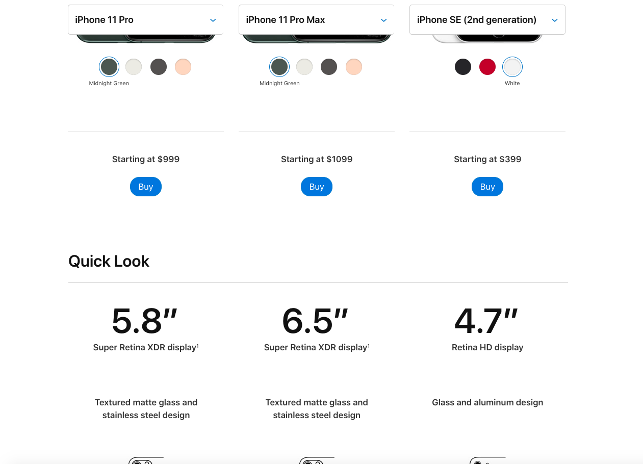
(Image credit: Cynthia Vinney, Apple’s Compare Phone Models – Quick Look)
The top of the compare products page is dominated by images of the users’ chosen products and their price points. Then, information is served up in a logical sequence as the user scrolls down the page, starting with a general summary “Quick Look” and getting increasingly technical.
The user can also navigate to buy the product at the top of the page or to a page to learn even more at the bottom. Meanwhile, the name of each product remains at the top of the page as the user scrolls so they never have to worry about losing track of which information is about which product.
Apple’s comparison experience replicates comparison shopping in a store while improving on it by providing a digital format created specifically for this task. This results in an incredibly useful tool that makes shopping easier.
What We Can Learn From Apple
While we’ve all gotten used to shopping online, little moments of innovation and assistance make the experience smoother and more enjoyable. Especially when it comes to big-ticket items or items that are difficult to choose between, anything that helps the user make their purchase decision more easily will improve their experience.
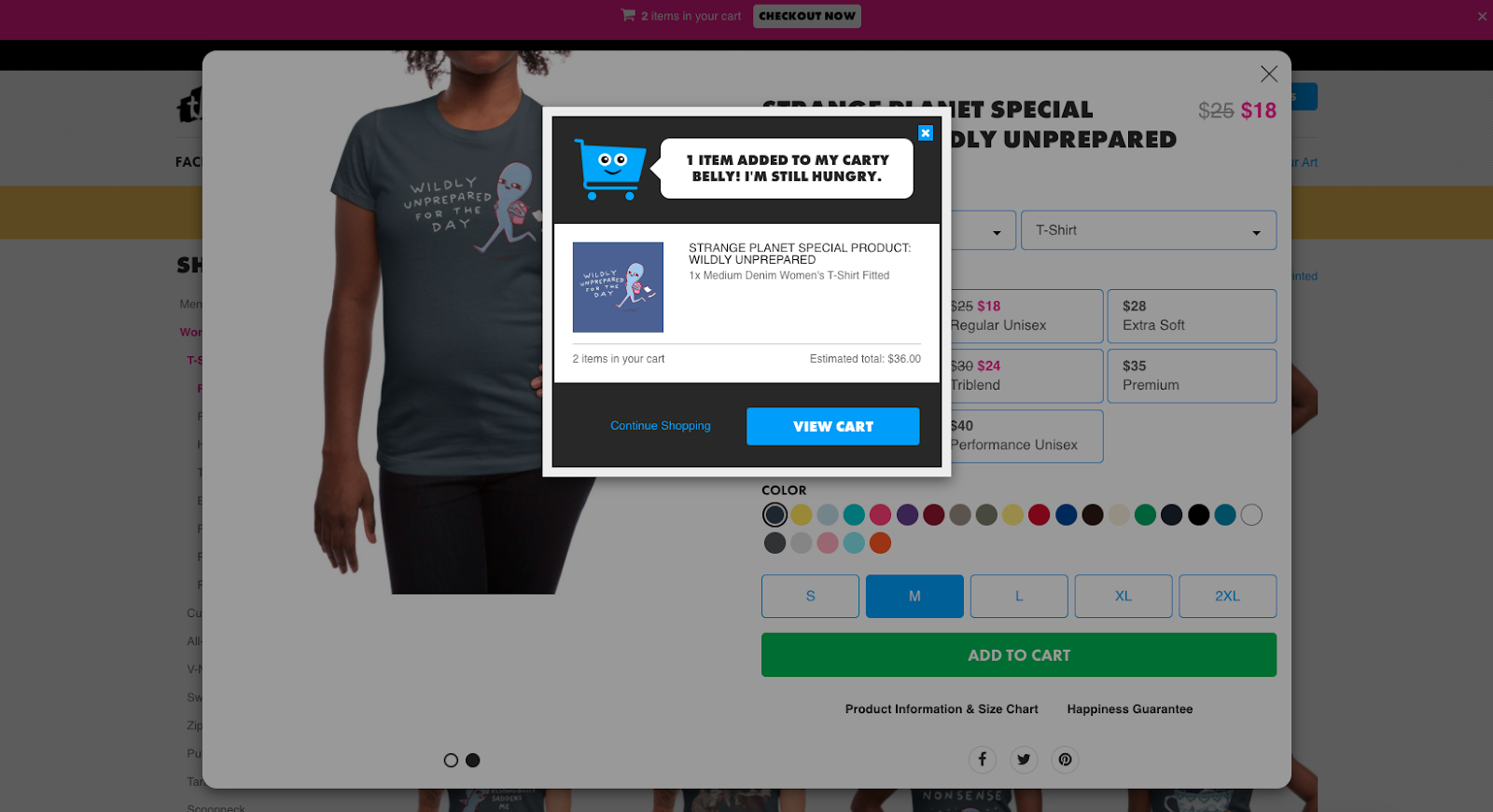
(Image credit: Cynthia Vinney, Threadless)
4. Threadless add item experience
Threadless sells t-shirts designed by a community of talented artists. The company has an irreverent vibe that revels in creativity, and that shows in the experience they’ve created to add an item to a user’s cart. At its core, this experience is like that of many e-commerce apps, but by adding a few unique touches, Threadless makes it more responsive and delightful.
After selecting the “Add to Cart” button on a product page, a pop-up appears acknowledging the addition to the user’s shopping cart, showing the item that was added, and providing the total price of all the items that are in the shopping cart. This level of communication not only assures the user they’ve successfully added the item they intended, it also lets them know approximately how much they’re spending — especially useful if you’re on a budget.
Plus, the cartoon of the cart at the top of the pop-up adds a level of whimsy and joy to the experience that’s in-line with the Threadless brand and makes the experience more fun.
What We Can Learn From Threadless
It’s important to communicate with users that they’re on the right track as they navigate through a digital experience. In an e-commerce experience, this means acknowledging when a user has added an item to their shopping cart. After all, the user’s action means they intend to buy the specific product, so letting them know they’ve chosen the right product and the right quantity of that product reassures them and makes the user experience feel that much smoother. If small moments of fun or delight in the way you communicate that information can be added along the way, so much the better.
(Image credit: Cynthia Vinney, Zoom)
5. Zoom experience
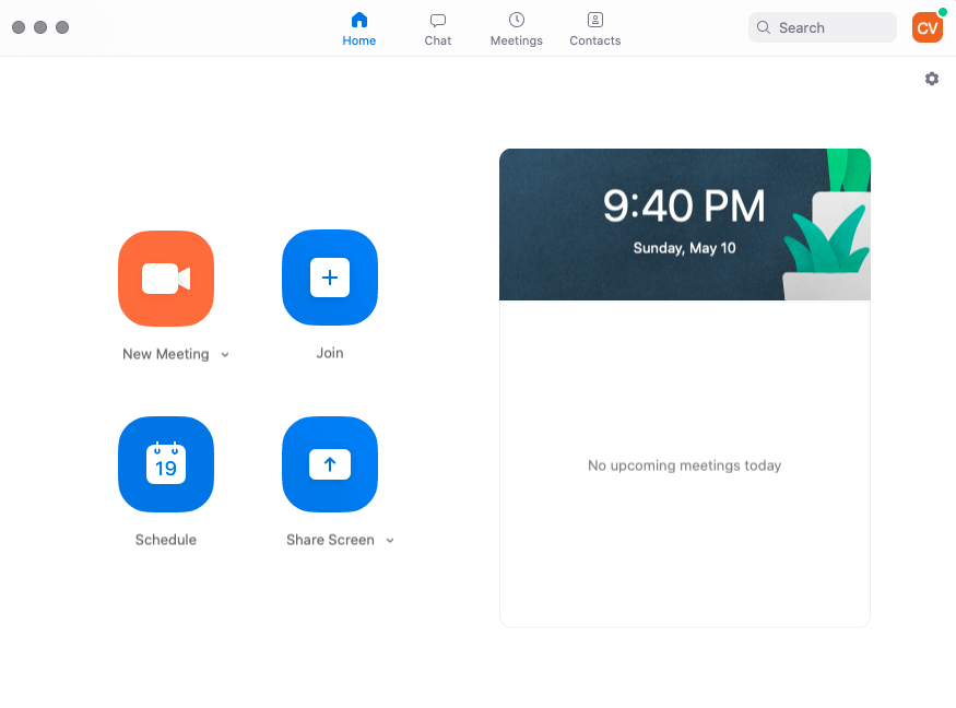
Zoom has become the go-to virtual meeting app—and it’s easy to understand why. Zoom’s home screen distills what can seem like a complicated endeavor into four simple options. You can start a meeting immediately, schedule a new meeting, join a meeting that someone else scheduled, or share your screen. After selecting any of these options, Zoom guides users to a new window where they can easily complete the task. The experience doesn’t include a lot of extra bells and whistles, but it doesn’t need to. The app surfaces the most likely tasks users will want to use Zoom to complete and makes it easy to get started.
What We Can Learn From Zoom
Zoom keeps things simple by focusing its top-level choices on the tasks users are most likely to use the app for. UX designers should always have a good idea of the tasks users will want to complete on the product they’re designing. Once they understand what a user wants to do with a product, the UX designer should surface the first step in the most important tasks as early in the user experience as possible.
Finding more examples of brilliant UX design
These are just a few examples of brilliant UX design, but there are many more. One way to find them is to start paying attention to the sites, apps and other digital products you use everyday.
Consider what you like about them and what they do differently from other products you’ve used. Pay particular attention to interactions that delight you or that you particularly enjoy. That way, anytime you touch a computer or mobile device you can learn something new about UX design.
Another is asking professionals which companies, apps, or sites they’re impressed by. We did just that in this video, by asking UX designers in New York which examples of great design they’re in love with:
Wrapping it up
If you want to learn more and become a brilliant UX designer yourself, then CareerFoundry’s free 5-day UX short course is a great start.
On top of that, you’ll also find the following articles useful:

