Every day we use countless mobile apps, interact with dozens of websites and launch desktop applications. Within each app and platform, we find a diverse set of user interactions, from pull-to-refresh to infinite scrolling to cards. But have you ever stopped and thought about how these interactions originated?
It’s easy to take these interactions for granted. They may have been brand new at one point, but as they became familiar to us, they quickly became almost unnoticeable. This is a good thing! After all, the best interactions are the ones we don’t have to think about.
But like superheroes, behind each of these interactions is an origin story. These stories may not involve saving the world or fighting off the bad guys, but they’re often more interesting than you might think!
1. Pull-to-refresh
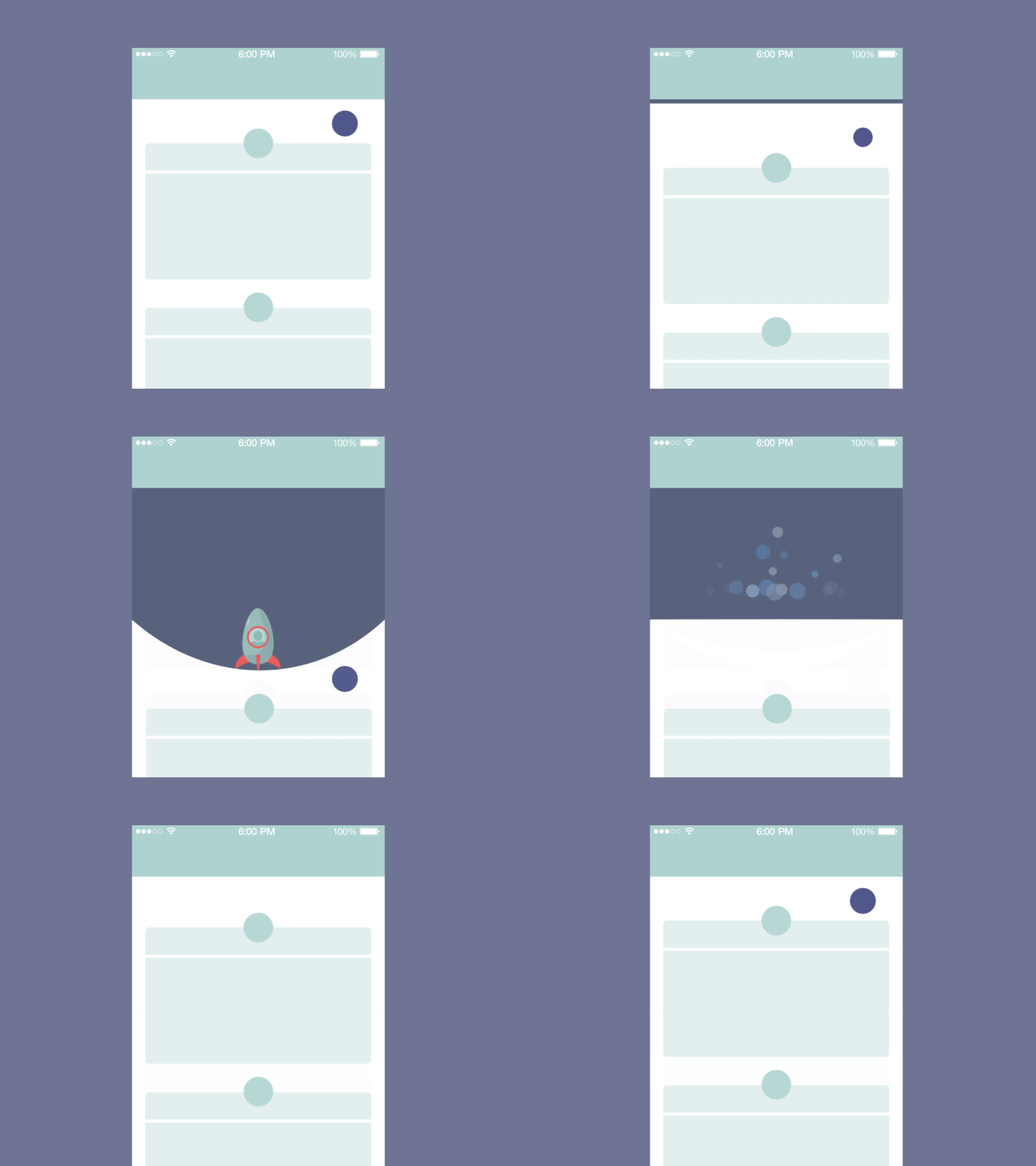 Image credit: Tubik
What started off as a fairly cryptic interaction can now be found in almost any modern mobile app. I don’t know about you, but one of the first things I do when playing with a new app is swipe down to see if there are any hidden functions waiting for me. Most of the time this is used to refresh a screen, but over time it has evolved to be used for other actions.
In Google Chrome for iOS, for example, pulling down will refresh the page, but the user can also move their finger to the left to open a new browser tab, or to the right to close the current open tab.
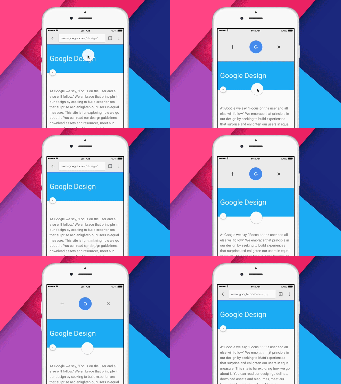 Image Credit: George Otsubo
This is a pretty clever evolution of the pull-to-refresh concept. And, in true Google fashion, the stretchiness and bounciness makes the interaction fun and tactile. If you haven’t played with this interaction, open up google on your iOS device and give it a go! It’s actually a lot of fun.
Believe it or not, the origin of this interaction can be traced back to it’s very first implementation in an app called Tweetie, which was an early mobile client for Twitter, created by designer Loren Brichter.

Since this first implementation, the pull-to-refresh interaction has infiltrated nearly every modern app like Apple Mail, Instagram, Facebook and countless others. But some designers argue that this pattern is bad for the user and is merely a relic of a previous era.
Regardless of where you find yourself on the pull-to-refresh debate, it’s pretty impressive that this interaction, with it’s humble origins, has found its way into nearly every mobile app on the planet.
2. Cards
If you’re not already familiar with cards, they are a UI pattern which takes related pieces of information and contains them within a container, or “card”. This pattern has grown immensely in popularity over the last few years on mobile and desktop platforms. It has even become a staple of Google’s Material Design.
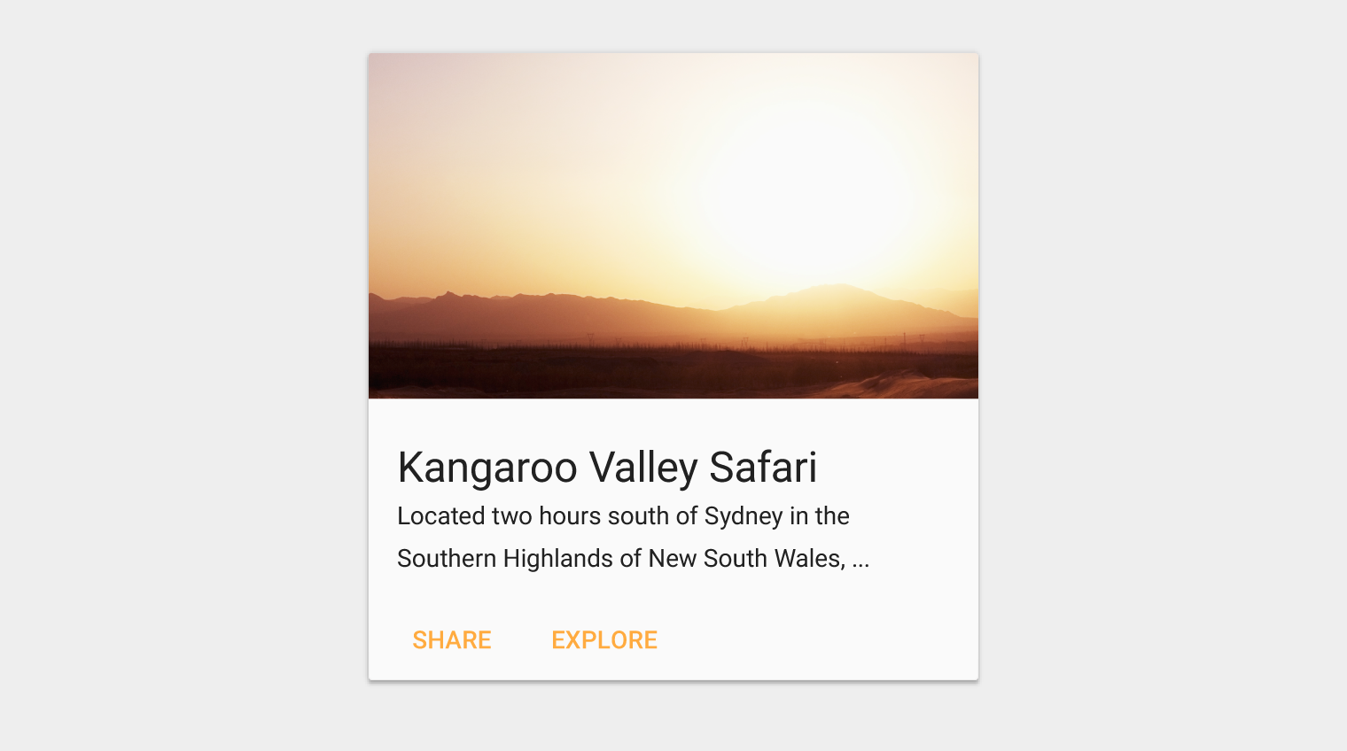
Cards can be super handy for organizing large sets of information. They also help the user easily scan and differentiate the content on a page since each section is contained within the boundaries of it’s card.
It’s hard to say when this pattern first appeared, but it was popularized by Pinterest, which used this pattern from the very beginning to organize pins.
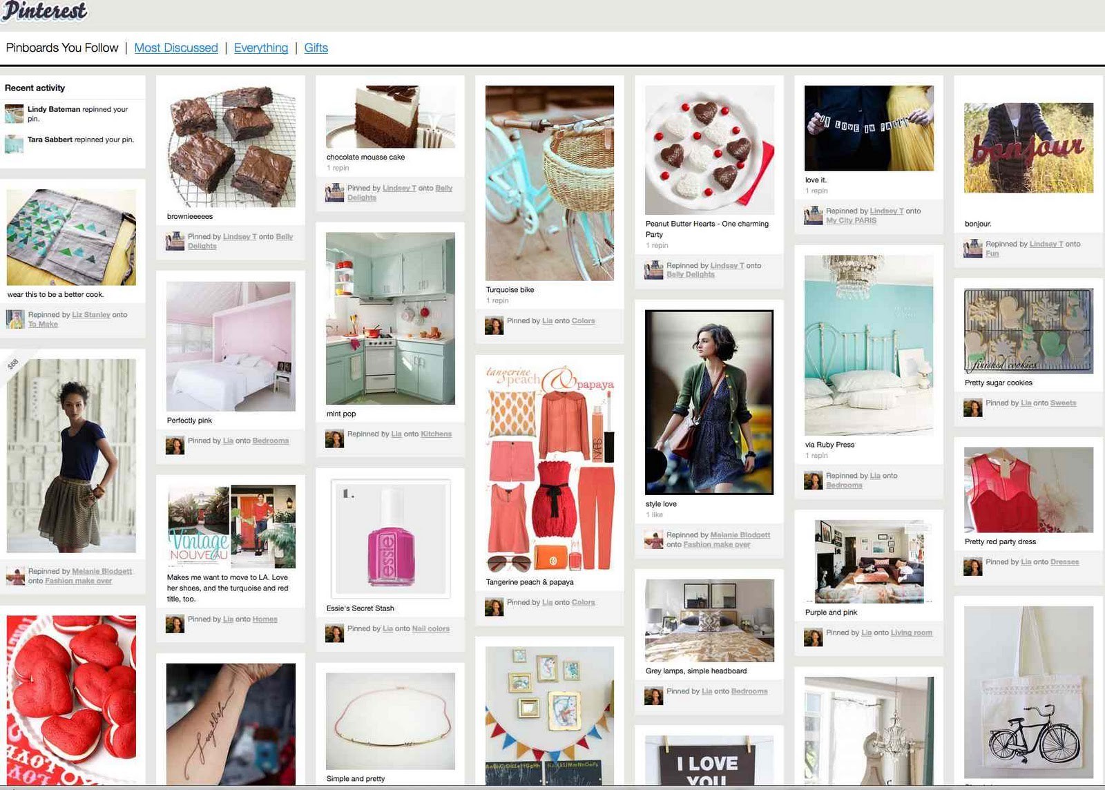 Pinterest circa 2011
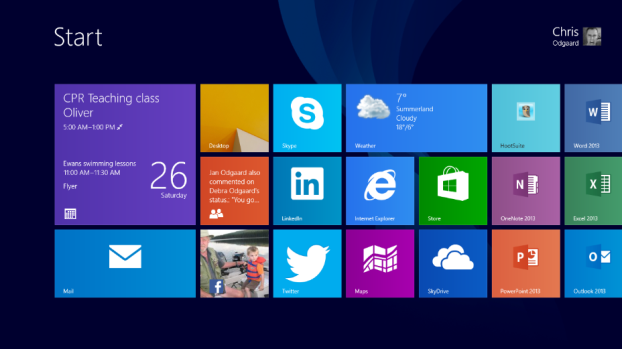
Since then, this pattern has been adopted by the likes of Twitter, Facebook, Microsoft and, as mentioned earlier, Google. Microsoft calls their cards “Tiles”, but the concept is the same and it has become a theme of their modern design style.
Unlike pull-to-refresh, however, cards are generally regarded as a user friendly pattern that’s useful for making information more digestible and traversable for the user. That being said, there’s a right and wrong way to implement a card and quite a bit of theory behind them. Check out this article on The Next Web for a deep dive into the world of UI cards.
3. Swipe for yes/no
Anyone who has used Tinder (which, let’s be honest, is most of us at this point) knows how this one works. This interaction was initially popularized by the dating app, which allows you to swipe right to indicate you like a person’s photo, and left to indicate you don’t.
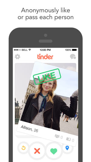
The card pattern which we previously discussed is at the core of Tinder’s swipe right interaction. It gives the user the feeling that they are literally flipping through an endless deck of cards, making it easy to quickly review a large amount of potential dates. And while Tinder implemented this interaction as a quick means of rating a person’s physical features, at its core, the interaction was revolutionary and has since evolved and infiltrated many modern apps.
For example, Shapr uses the swipe right / left pattern to help you find people nearby to network with. Feeld implements the swipe pattern in a similar manner as Tinder, but with a slightly different purpose. Jobs by AngelList allows you to quickly sift through potential jobs using the swipe right / left paradigm.
Many designers have billed the swipe right interaction as the future of UI. It plays on a fundamental psychological principle in humans, called Hick’s Law, which states that the more options a user has on a screen, the harder it will be for them to choose an option. Tinder’s swipe right interaction works so well because users only see one person on a screen at a time, which makes it easy for users to quickly size the person up and decide whether to pass or fail. This interaction provides immediate gratification and positive reinforcement. And over time, users begin to crave the act of swiping.
Summary
In order to design for the present, you have to understand the past. My hope is that by uncovering the origin of these popular, everyday user interactions, you’ll be encouraged to research and better understand common UI patterns before implementing them in your own designs. Thanks for reading!
To learn more about the intersection of UX and UI design, check out this guide: How UX and UI designers work together.
And to see more great examples of design, check out these articles:
