Tutorial 3: An Introduction To CSS And Responsive Webpages
💬 “You can often view glimpses of ingeniousness not as inexplicable miracles, but as residue of experience. And when you do, the idea of genius goes from being mesmerising to being actively inspirational.” (Grant Sanderson)
Introduction
Welcome to day three of your web development short course! Yesterday, we worked with HTML and laid out the foundation for your website. However, the website we made doesn’t yet look like the websites we use on the internet. That’s because with HTML, we only define the structure of our page, not the styling; that’s a job for CSS. Today is all about styling. If yesterday was the day we made our webpage usable, today we’ll turn it into something that people will actually want to use.
Today we’re taking a first look at CSS, and we’ll use it to structure our page as per our wireframe. CSS, as we learned earlier, is the second pillar of the web, along with HTML and JavaScript. At the end of this tutorial, we should have the basic skills to structure elements on our webpage. CSS cannot be used without HTML, and HTML without CSS can feel a bit boring, so we recommend you go back and forth between HTML and CSS and learn them together.
What are we going to do today?
- Learn about CSS
- Use different types of CSS selectors
- Apply CSS Grid
- Learn about mobile responsiveness and media queries
- Position the elements of our page
- Your turn
- Daily challenge
Ready to dive into the beautiful world of CSS? Let’s get started…
1. An introduction to CSS
CSS, or Cascading Style Sheets, is a way to style our markup (usually HTML). It is what you’d use if you wanted to change the color of some text or create simple animations. That and limitless other styling options are possible with the use of CSS. Essentially, every website, however shiny, is made with the same CSS that we’ll be learning in this course.
CSS is what programmers like to call ‘declarative’; in other words, you declare what you want, and CSS gives it to you. Say you want the heading text to be bold and red in color, you’d do something like the following, and that’s it. You’ll have a bold red header!
Let’s take a step back and consider what happened.
We started by writing h3, which is called the selector. This is like aiming a target. Here, we target all h3 elements. Then we have opening curly braces ( { ) and a couple of lines in them ( color: … and font-weight: … ). Each of these lines is a particular style that will be applied to the element being selected (h3 in this case).
Let’s take another example, this time actually working on our project. Remember this piece that we wrote yesterday when we were learning HTML?
Let’s make the bio quote text a little more stylish. How about italic? Wait, but where do we write our CSS?
Writing CSS
Create a file called styles.css the same way we created index.html on day one of this course (you can review the day one lesson if you get stuck). Once that’s done, add the following line just before the closing head tag (</head>) in your index.html file.
The styles.css file is where we write all our CSS. Check this commit for how we did it.
Now, back to our task. Assuming you have your styles.css file open, write the following in there:
Refreshing the browser should show something like this. Notice how “{{ Pause and ponder }}” appears in italics.
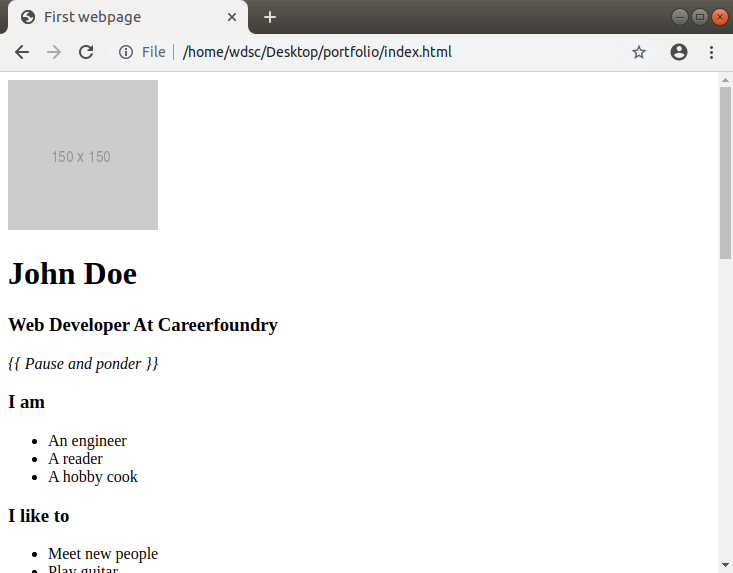
If it does for you as well, congratulations! You’ve successfully written your first line of CSS. In case it doesn’t, check that the files are properly linked (check to see if there’s a typo in the file name and make sure both the files are in the same folder).
While this works, this would also make all the paragraph elements (<p>) on our page italic, which is probably not what we want. To fix that, let’s try to give this element (<p>) a specific identity so that we can style that particular identity. We’ll do this by adding a class attribute called ‘quote’. Classes are used to define particular styles for all of the elements that share the same class name.
index.html [we’ll call this HTML from now on]
styles.css [we’ll call this CSS from now on]
Note that you’ll have to replace the paragraph selector (p {}) with this quote class selector (.quote {}). See the commit for how it is done
Refresh the page, and you should see no difference. But this time, we’re only applying our styles to a particular element with the class name ‘quote’.
Did you notice how we put a period (.) in front of the class name (that is, .quote)? That’s called a class selector. In the next section, we’ll briefly look at some CSS selectors and get an idea of when to use what.
2. CSS selectors
A CSS selector is so named because it selects a particular element or group of elements in the HTML and applies styles to just those. We’ve already looked at some of them today, but let’s get to know them a bit better now.
Element selector
An element selector selects one or more of a particular HTML element. An example of an element selector would be p { }, which, as we saw, styles all the paragraph (<p>) elements on a page.
For example:
HTML
CSS
This would make the text “How many sides are there in a triangle?” red, along with any other text inside of any <p> element on your page.
Class selector
A class selector targets all elements that have a particular class name. Just as a refresher, we add a class name to an element using the class attribute on an HTML element. For example:
HTML
CSS
This would make “How many sides are there in a triangle?” and “What does Pikachu evolve into?” appear as bolded text, while “3” and “Raichu” would be green.
ID selector
ID selectors are quite similar to class selectors, except that we set an ID to an HTML element using the id attribute and select it in CSS using the hash or pound character before the ID name.
HTML
CSS
😎Pro tip: It might seem like ID and class do the exact same thing, and you’d not be wrong in thinking that. However, IDs are used for the particular unique instance of an element that doesn’t repeat on the page (a ‘Send message’ button, for example) while classes are used for elements that are repeated (e.g. a to-do item in a to-do list can share the class name with the rest of the items in the list).
Note that there are other advanced selector patterns that we do not need just yet, but we’ll provide you with the resources in order to learn more in the references section at the end of today’s tutorial.
Now that we know a bit more about how to use CSS selectors to style specific elements, let’s look at how to use CSS to structure larger parts of your webpage.
3. A brief introduction to CSS grid
CSS grid is a really powerful tool used to structure parts of your webpage in a grid so that you can organize and control the layout of your page. A grid in CSS is exactly what it is in real life; a space divided by horizontal and vertical lines into rows, columns, and cells—a table, if you’d like to think about it that way.
With CSS grid, we first define how our grid is structured in terms of percentages, pixels or any other measurements, and for each item that we put into our grid, we define what cell that element should go in, roughly speaking.
Let’s look at an example using a simple 2x3 table:

To make this table, we do the following:
CSS
HTML
display: grid tells the browser that this is a grid container (i.e. we intend to have rows and columns inside this element), while grid-template-rows and grid-template-columns do exactly as their names suggest, set the number and dimension of each row and column in the grid respectively.
We define a grid with two auto width rows and three auto width columns. Auto width is an automatically set width, which means our grid is flexible and can end up looking very asymmetric depending on what content we put inside it.

For instance, this is also a 2x3 grid, exactly the same in terms of the number of rows and columns, but the columns (and rows) have different specified dimensions.
😎Pro tip: Instead of auto, you can use percentages (50% 50%) or pixels (300px 300px) or any other unit of measurement at your disposal. Grids are very versatile. If you can draw it on paper with a ruler, you can make a grid out of it!
So, why do we need a grid? It has to do with how your content will be viewed on different screen sizes. That brings us to our next topic, designing for mobile responsiveness.
4. Mobile responsiveness
A couple of decades ago, people used the internet and world wide web via a very limited set of devices, mainly desktop computers. However, times have changed, and we now have an array of devices that we use to access the internet. As a result, web development has had to evolve, just as the devices did. Web development is often compared to visual art—painting, for instance. But unlike an artist’s canvas, a developer’s canvas is extremely flexible. It’s just an inherent and exciting part of working with the web.
For this reason, it is imperative that we embrace responsive web design right from the start and remember that our website should be just as usable on a smart TV as it is on a smart watch (not to mention a laptop or a smartphone). To see what we mean, check out the picture below, where the way the content is displayed changes as the screen size changes:
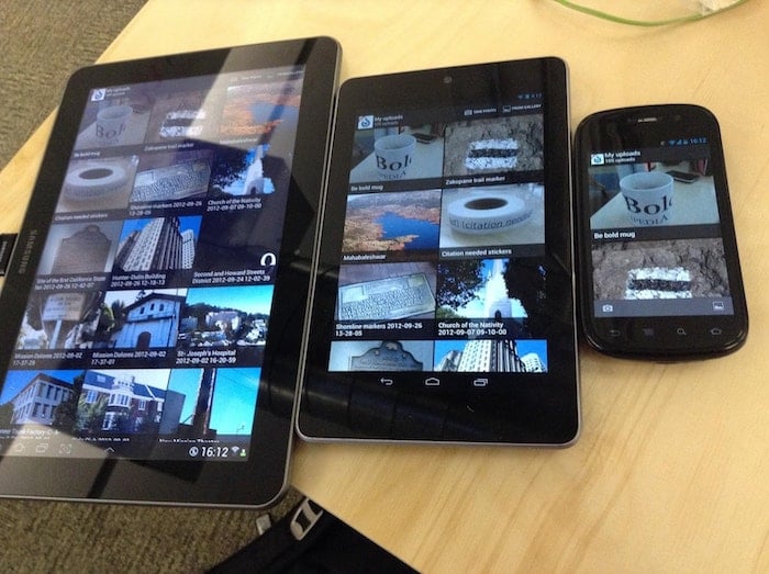
Wikipedia User:tfinc [CC BY-SA 3.0 (https://creativecommons.org/licenses/by-sa/3.0)]
Remember the grid we designed in the previous section? A three column layout might look good on desktop computers, but things would really get squeezed on mobile. What if there was a way to have the layout respond to the user’s device and display the appropriate layout accordingly?
5. A brief introduction to media queries
A media query is a conditional block of CSS code that only runs the CSS code inside if the condition in the media query is met. Let’s consider an example now.
grid-template-columns, as we saw, sets the number of columns and their dimension. Here, it is taking the value 100% (one column with full width), 50% 50% (two columns with 50% widths each) and 1fr 1fr 1fr (three columns with 1 fractional unit width each. I.e. ⅓ or three equal sized columns).
Notice the two lines starting with a @media. Those are our media queries. The condition we’re using here is min-width, which essentially says to run this code if the width is at least the specified number. So, if the screen size is more than 600 px, it will use 2 columns, and if it is above 900px, it will use 3 columns. 600px and 900px here are formally known as breakpoints, as in, those are the widths at which our webpage transforms into something different.
Note that we didn’t repeat display: grid. This is because unchanging properties don’t need to be duplicated. That’s how all responsive web development is done, no matter how complicated it might seem at first.
Phew. Thank you for sticking around for the last few sections of theory. Now it’s time to get back to coding! Today, we’ll put into practice all that we just studied and give our webpage some structure.
6. Your turn: Positioning elements on your page
Remember the wireframe from the previous tutorial? Let’s look at it again
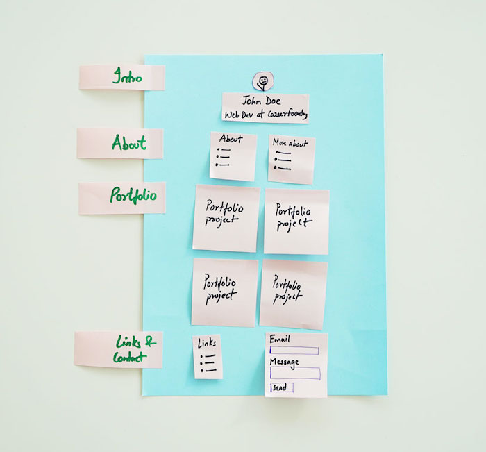
As per our wireframe, we wish to give our website a fixed width and to center it on the screen. To do that, we’ll wrap all of our content in an HTML element and set equal ‘margins’ (or empty space) on both sides.
HTML
CSS
If you refresh the page, you’ll see that there’s a margin on both sides of our content. This is called a fixed width layout (because we specified a particular width). The alternative is a fluid width layout where content just uses all the width available to it.
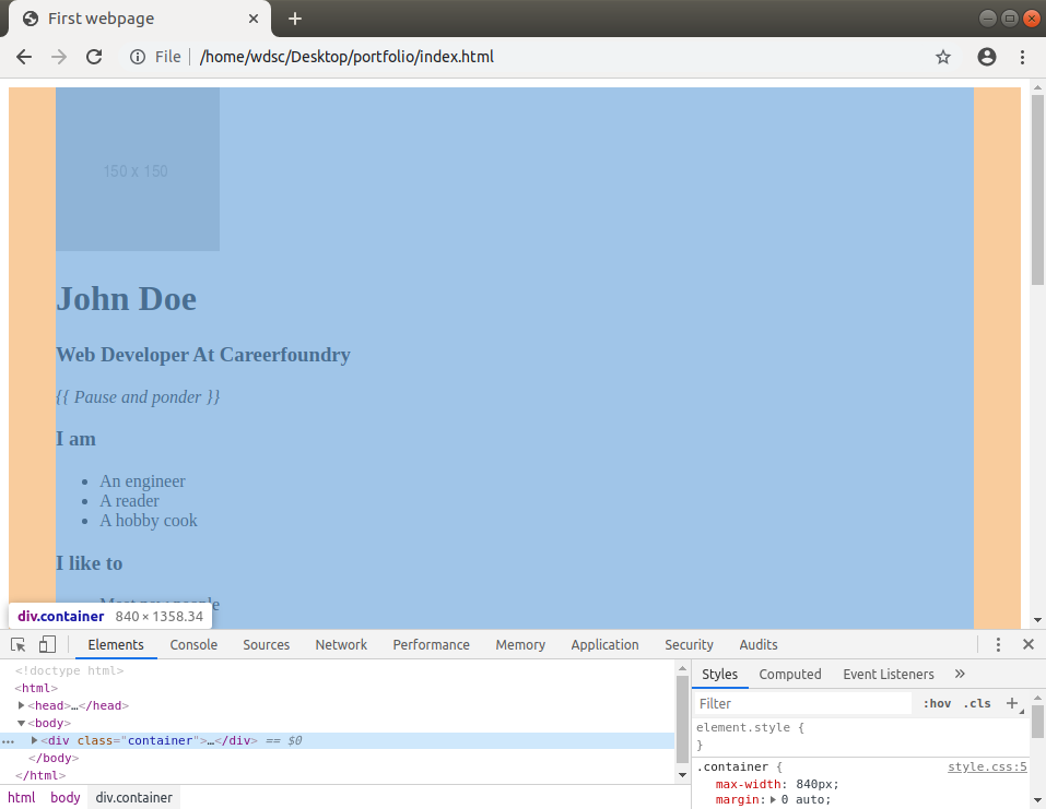
Next up, we would like to have the name, professional title, and quote center aligned. We’ll name the div holding our content ‘intro’, and then style it.
HTML
CSS

This is what you should see. Looks pretty nice, right?
Good. Let’s move onto the next section. We need the ‘about me’ lists to be arranged horizontally, one on the left and the other on the right. Let’s use CSS grid!
HTML
CSS
Notice how we declare a 2-column grid in the .about-grid class with 50% percent width each. As you learn more about grids, you’ll learn more ways of accomplishing this very thing, and depending on the situation, one way will have certain advantages over the other. For our use case, 50% is good.
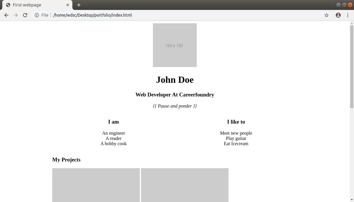
Notice how you got the two lists centered and split in the middle. We can use Chrome Developer Tools to inspect the grid and see exactly what is happening.

Looks good. But I wonder what happens if we resize the browser and simulate a mobile screen? To do that, in the Developer Tools, click on the “Toggle device toolbar” button. If you can’t find it, just use the shortcut Ctrl+Shift+M.

You should see a reduced sized window pop up.
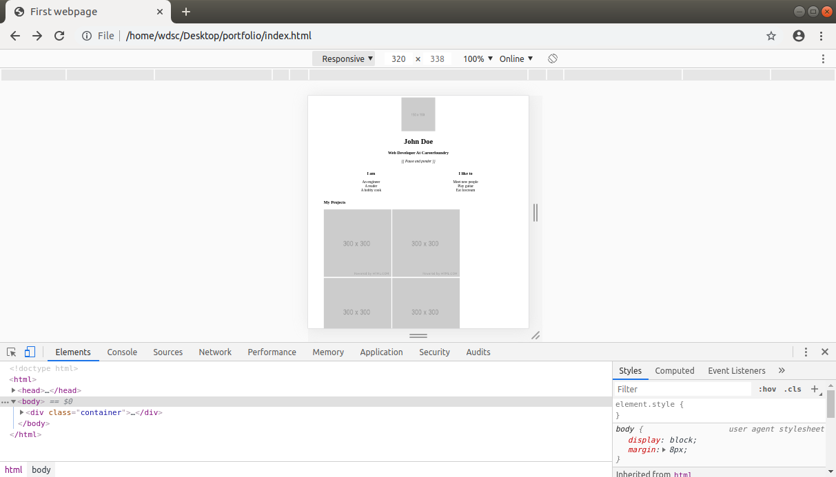
Note the menu on top where it says “Responsive”. Here you can simulate the screen sizes of different devices (say you want to see how a page looks on iPhone 6). If you look at our website, it looks a bit weird. We need to fix this by adding a new HTML tag in our <head>. We place it just before the closing head (</head>) tag. This tag hints the browser to show the webpage in mobile size (and not a zoomed out desktop version of the website).
HTML
Let’s add the tag and refresh our browser.

Okay, now that looks less weird, although still not perfect. We would ideally like to have the “About me” lists to be one below the other on mobile devices and screens that are something like below 480px. Let’s write the code for that.
CSS
That’s it. We define a breakpoint of 480px, and say that if the screen size goes below that (with max-width), the code inside should run. Let’s refresh our browser and check if that works.
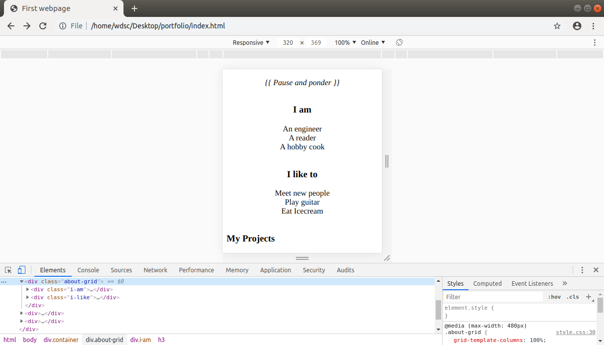
That’s better! To make sure the media query works, change the width of the window (use the input field above the window that has the Responsive dropdown) in which our website is rendered from 320px to 481px (just over our breakpoint).
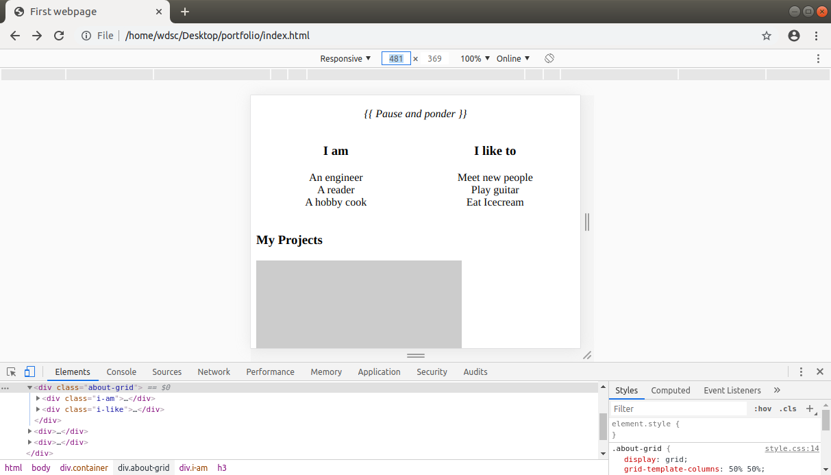
Did you see how it changed to the 50% split that we coded earlier above 480px width? That’s the power of media queries!
We can now make similar changes to all the remaining sections. For the projects grid, we’ll make it 2x2 on desktop and 4x1 on mobile. At this point, you should try to read the code yourself and understand what’s being done. That will also get you into the habit of reading code, yet another skill a developer needs to have.
😎Pro tip: Try to read as much code as you can and understand it. Then try to write it yourself without looking at the course, and finally, when you think you’re done, compare it with our code. Find out where and why your code was different. It doesn’t have to be identical, as long as it works well on different screen sizes.
HTML
CSS
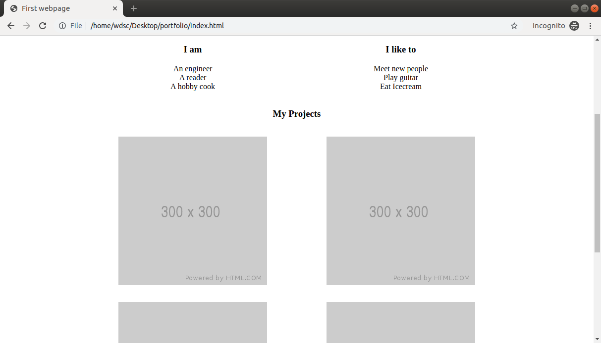
Did it work for you? Don’t worry if not. It takes some time! Give the next one a try.
This is the links and contact section. This section should also be divided into two columns, but not split by 50-50. Since links are relatively narrower, let’s split this into 30-70.
HTML
CSS
If you’ve made it this far, congratulations! We’ll admit that it wasn’t easy, and we’re super proud of you ❤️️. Tomorrow, we’ll look into more CSS and make the page stand out with colors! We hope you’re just as excited about it as we are. See you then.
🧐Daily challenge
Today’s challenge is a bit academic! But don’t worry. This will come in immensely handy for any future CSS endeavours (starting tomorrow).
- Study, and make notes (on paper or in a doc online) of all the units of measurements of CSS, namely:
- Pixels (px)
- Relative units (em and rem)
- Viewport width and height (vw and vw)
- Read more about CSS Grids and find at least one more way of splitting a section into two halves (i.e. 50-50% split). Did you find a simpler way?
Both challenges can be completed by referring to the material in the References section of today’s lesson. Have fun!
📗 References
❓ FAQ
Q. You taught about various types of selectors! Which one is the best?
A. Like always, it depends on the situation. If there’s only ever going to be one form on a page, element selector is good enough. For common elements like paragraphs and headings, we recommend using a class selector. For one off unique elements like an error message, ID selector would be a good fit. The intuition for selecting the selector comes with time and practice.
Q. Why did you teach CSS grid and not floats / flexbox / something else?
A. For our use-case of a two dimensional table, a grid works well. Learning grid is a worthwhile investment as most web layouts can be easily created with it.
Q. What’s the screen size range that I should design a website for?
A. It really depends on what device your target audience is using. For most websites, a lower width of 320px and a max viewport width of 1280px works fine. Now the user’s browser could be a million pixels, but your website will still show in 1280px width. This is called a fixed width layout.
The other option is a fluid width layout (the website is as wide as the user’s browser). This is a little tricky to get right, but makes up for the hard work in the form of a website that has more room for content.
Q. Is creating a wireframe compulsory?
A. In general, you should have a good idea about what you’re building. We use it as our source of truth when making decisions. For any non-trivial project, we’d recommend you start off with a wireframe. You can use online tools for the purpose, but pen and paper works too!
Alana
Senior Program
Advisor
You can become a job-ready web developer from scratch in as little as 6 months. Arrange a call with your program advisor today to discover how you can change your career from the comfort of your own home with the CareerFoundry Full-Stack Web Development Program.