Tutorial 2: An Introduction To Wireframing And UI Elements

Introduction
Welcome to day two of your UI design short course! We started off strong yesterday, so let’s keep the enthusiasm going.
Today is all about structure. We’ll learn about the bare-bones structure of an app screen, otherwise known as a wireframe—and we’ll learn why wireframing is such an important step.
We’ll also learn about UI elements and will use them to create our first low-fidelity wireframes for our app screen. Make sure you’ve got a pen and some paper to hand, as we’ll be doing some sketching.
Let’s look at what we’ll be covering today in a little more detail:
- Introduction to wireframes
- What are the different types of wireframes?
- Introduction to UI elements
- Creating low-fidelity wireframes for our app screens
Ready for another day on our UI design adventure? Let’s go!
1. Introduction to wireframes
Consider the role of an architect. Before they get stuck in with designing a beautiful house for their clients, they first need to create a two-dimensional blueprint of the house’s structure. This blueprint will help them visualize where the entrance and exit points will be, the direction that people will walk in, and how each room can be best utilized. It’s a functional jumping-off point for the rest of the home’s design.
Think of a wireframe as a blueprint for digital products. Wireframes are basic visual representations of a screen’s content and functionality. They provide a clear overview of the page structure, layout, information architecture, user flow, functionality, and intended behaviors.
As wireframing occurs in the early stages of a digital product’s life cycle, wireframes are usually comprised of basic shapes and symbols. Colors, fonts, images, and other stylistic features are omitted to keep the focus on the screen’s core elements. Depending on how much detail is required, wireframes can be drawn by hand or created digitally.

There are AI tools that can help with various stages of the wireframing process, like Visily and Uizard,but it’s best to start the process with your own thoughts and ideas. It’s important you have a good understanding of your own design and can visualize it for yourself at the early stages. Remember what we covered yesterday—AI tools should leverage your own strengths, not replace them.
What is the value of wireframing?
Now that we’re familiar with the concept of wireframing (the process of creating wireframes) let’s take a closer look at the importance of wireframing in UI design.
- Wireframing in the early stages will allow you to gather honest feedback from stakeholders and identify key pain points that help to establish and develop your concept. It’s also the easiest way to test your ideas, and the wireframing process might see you go in a completely different direction. Once your app or website has taken its final form, documenting your wireframing process will enable you to talk confidently about each stage of your product’s evolution.
- Wireframing is a communication tool. Through your wireframes, your clients and stakeholders should clearly understand the function and purpose of specific features. Seeing the elements sketched out on a wireframe will also allow you to visualize how they all work together—and may even prompt you to decide to remove a few if you feel the interface is getting too cluttered.
- If you have a pen and paper to hand, you can quickly sketch out a wireframe without spending a penny—and the abundance of tools available means you can also build a digital wireframe within minutes. By exposing the very core of the page layout, flaws and pain points can easily be identified and rectified without any significant expenditure of time or money. The further along you get with your design, the harder it is to make quick changes!
2. What are the different types of wireframes?
With us so far? Glad to hear it! Let’s take a look at the different kinds of wireframes you’ll come across in UI design.
Low-Fidelity
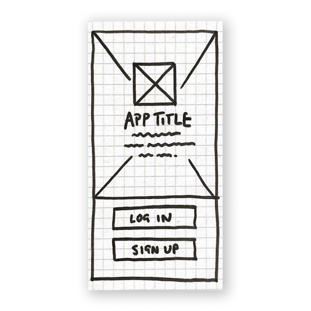
The easiest way to create low-fidelity wireframes is with good ol’ pen and paper. Basic shapes are more than enough to communicate the hierarchy of content on a single screen. Low-fi wireframes can also be designed with tools like Invision Freehand, which is the digital variant of drawing wireframes on a whiteboard. Here’s the low-fidelity wireframes we created for the welcome screen of our climate change app, Ethical Eater:

Medium-Fidelity
Once you’re happy with your content’s overall structure, next up is your medium-fidelity wireframes. This is where you’ll refine and adjust your content. At this stage, you might migrate your wireframes to your chosen digital tool, like Figma, and introduce grid systems that help you to get a more accurate spacing between each element. You can also adjust the sizes of each component.
This might be the part of the process where you start to work with AI tools like Visily, a free and beginner-friendly AI tool that takes various prompts like text, screenshots, URLs, sketches, or templates and transforms them into editable wireframes for you.
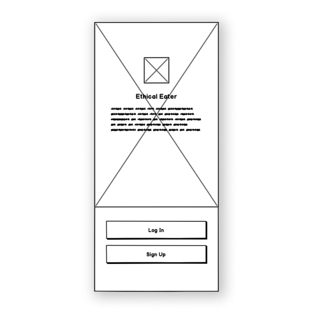
Check out our mid-fidelity wireframes below. Notice how it’s a cleaner, more detailed iteration of our low-fidelity wireframe?

High-Fidelity
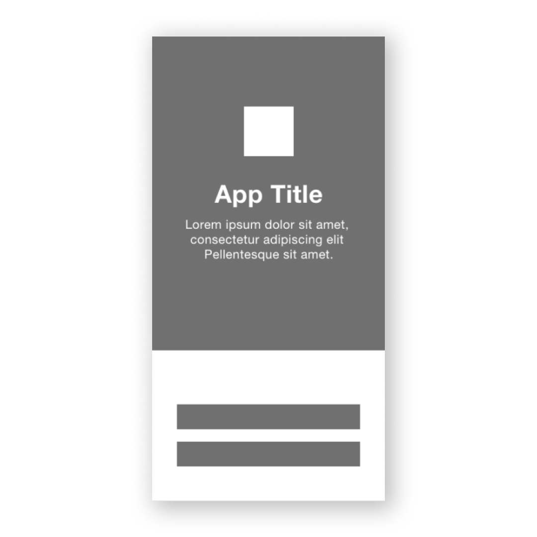
High-fidelity wireframes are the final stage of wireframing. At this stage, all your UI elements should be accounted for, and your visual hierarchy should be finalized. Below, you can see our high-fidelity wireframe for the Ethical Eater app.

Mobile wireframing best practices
Before we jump into the practical part of this tutorial, let’s look at two key best practices to bear in mind when wireframing for mobile screens.
- All wireframes should be in grayscale, meaning only black, white, or gray. This helps you to focus on the usability of the design (without the distraction of colors and images). It also gives you the freedom to make changes easily and stops you getting too attached to your designs in the early stages. To indicate various colors or active buttons, you can play around with shading—like using lighter shades of gray to represent light colors, and darker shading to represent bolder colors. You can also use diagonal line strokes to represent a background or shaded block, and two lines crossed over to serve as a placeholder for a logo or image.
- Remember that your users need to be able to tap on each element with ease. Each element (button, input bar, etc.) needs to be big enough to accommodate the average size of a fingertip, while also being surrounded by enough space to avoid the user accidentally tapping on something else. This is referred to as touch targets. We’ll talk more about touch targets tomorrow.
Bear these two tips in mind as you’re going along, and you’ll be onto a winner!
3. Introduction to UI elements
Throughout this tutorial, we’ve used the term ‘UI elements.’ So what exactly are they?
Put simply, UI elements are the building blocks used to create apps or websites. They’re individual ‘parts’ that provide interactive touchpoints, guiding the user around each page. UI designers use UI elements as a visual language that establishes consistency across a website or app. By having them there, users can navigate a digital product without thinking too much about what they’re doing.
There are four main categories of UI elements:
- Input controls
- Navigation components
- Informational components
- Containers
Let’s look at these a little more closely.
- Input controls allow users to input information into the system. These include drop-down menus, forms, and buttons—just like you’ll be designing on your app screen.
- Navigational components help users navigate an app or website. These include a tab bar or hamburger menu.
- Informational components share information with users, such as a pop-up box or progress bar.
- Containers hold related content together.
To learn more, take a look at our glossary of UI design elements.
4. Creating low-fidelity wireframes for our app screen
Now it’s time for the fun part: creating our wireframes! For this task, you’ll need a pen or pencil and some paper. Lined or scrap paper will do as long as you’re able to see your sketches clearly.
Time to sketch! If you pick up your pen but find you don’t know where to start, try using an AI tool like ChatGPT for some inspiration! You could ask it what the five most common components or features for a mobile app log in page are. ChatGPT can help to generate new ideas for designers, as well as provide checklists for concepts and early design stages.
When drawing your wireframe, think about the first impression you want your app to make with a new user. A few things to consider:
- How big do you want the buttons?
- Where do you want your logo?
- Do you want your imagery filling the whole screen, or only half?
Make sure you’re sketching everything, including the title and subtitle, and the words on the login and sign up buttons. You can also annotate your wireframe with notes to make it easier to refer back to.
If you mess up, don’t worry—now is the stage to do as many rough sketches as you need until you’re happy with the layout. It might look scruffy, but this wireframe will serve as your reference point for the screen’s digital design.
Get creative and why not try a few different versions to see what feels right? Once you’re done with your low-fidelity wireframes, put them somewhere safe or take a picture. You’ll refer back to it in tomorrow’s tutorial.
Summary
And with that, it’s a wrap for day two! Wireframing might seem like a simple and basic step, but without it, we can’t move onto the more exciting bits—like typography and color. Understanding the wireframing process is a fundamental part of being a UI designer, so it’s important to get into the habit of sketching out your designs. That’s another reason why AI can’t solve all your design problems; human input will always have the creative edge!
Tomorrow, we’ll migrate our wireframes onto our Figma design file, and fill out our screen with buttons, symbols, and an awesome logo for our app. See you then!
Daily task
Create some wireframes for your climate change app screen, and finalize the elements you want to include. For further reading, check out these blog posts:
Take the quiz below to make sure you've learned all the important information—and that it really sticks!
Alana
Senior Program
Advisor
Intrigued by a career in UI design? Arrange a call with your program advisor today to find out if UI design is a good fit for you—and how you can become a UI designer from scratch with the full CareerFoundry UI Design Program.